ROLE:
LEAD PRODUCT DESIGNER
CLIENT:
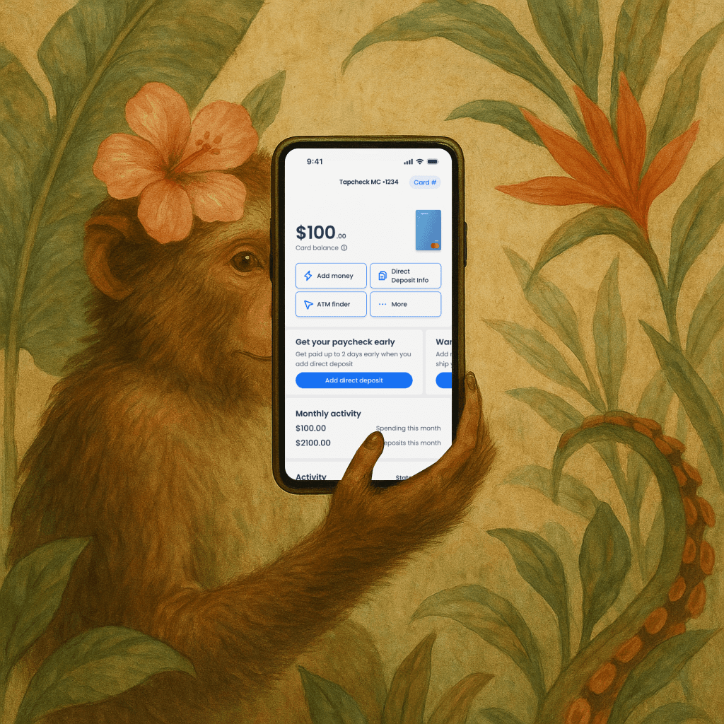
TAPCHECK
TEAM:
GROWTH

Optimizing transfer flow
for ease of use
Synopsis.
The volume of CS inbound was increasing related to our primary revenue product, how can we optimize our flow for users?
I led design from zero to 1 as a one man team, collaborating with our Head of Product, Senior PM, and engineering team to optimize our existing transfer flow.

Insights we're solving for.
Confusion on why they couldn’t transfer
Our team connected with our frequent flyer users (users that called support the most). The ability to move to the transfer tool and get error states suggested there was a balance to use, which created confusion.User’s couldn’t add a destination account
User’s that were in the transfer tool and hadn’t added a destination account (debit or bank account) were left in confusion with no way to add an account within the tool.Users struggled with errors (outdated ux)
We had 3 user decisions on one screen, this caused complexity in displaying error states and informing user what might’ve gone wrong.Users hit limits, that weren’t displayed
The team had launched a tool that allowed employers to put limits on the amount a user transferred, these limits weren’t visible to the user and provided confusion.
How can we push transfer success beyond 92%?
The original screens provided by the agency had multiple decisions for the user, it created confusion for users.
Our mission was to clean up the flow.

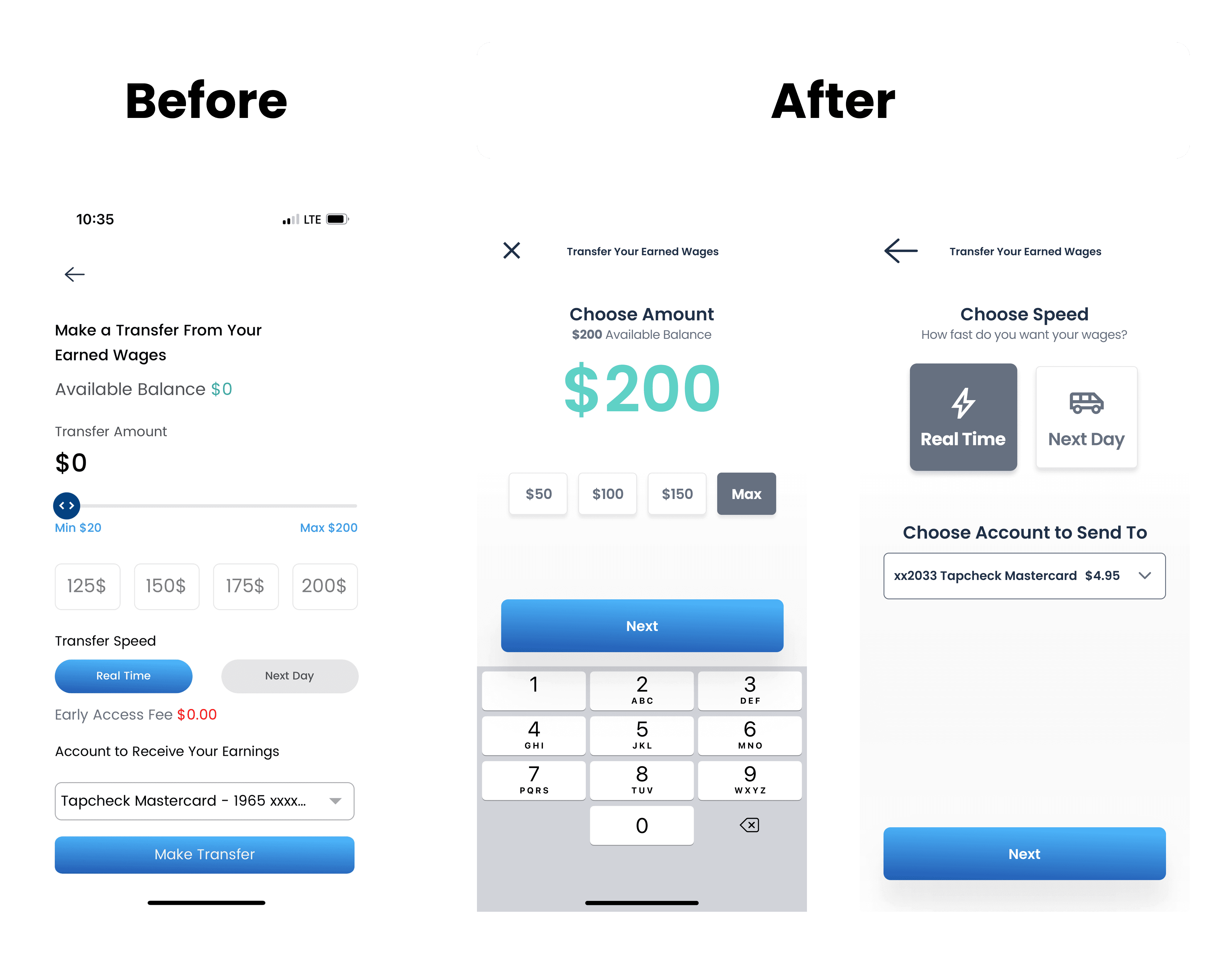
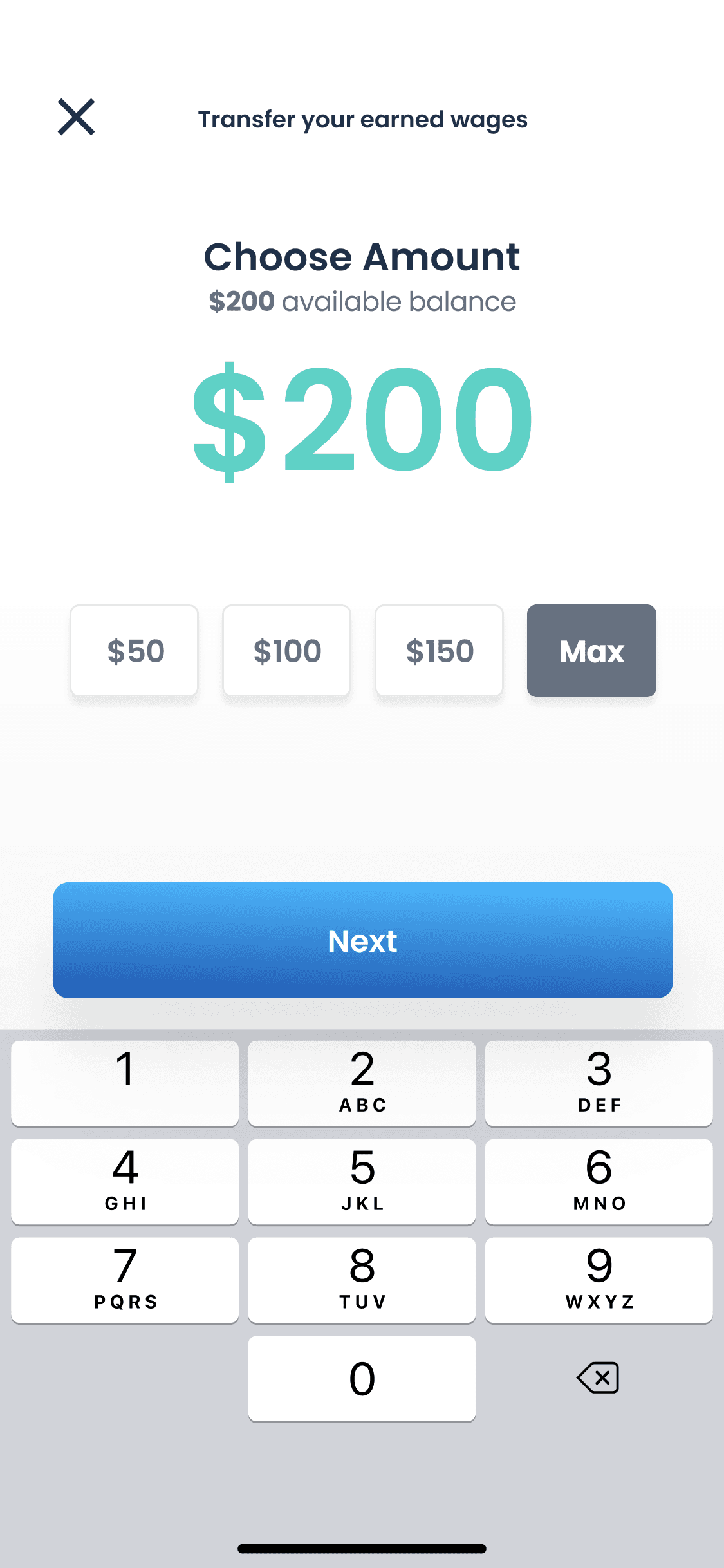
Simplifying choosing an amount
We simplified selection for users with default amounts, as well as allowing custom amounts catering to our many users that choose unique amounts.
Demo - Transfer flow
How a user transfers their earned wages to their debit card.

Our impact & what we learned
96% success rate
We increased our transfer success rate from 92% - 96% with the new transfer flow, a key revenue driver.
We slowly increased feature flag to 100% to test against prev flow.
27% Reduction of CS inbound
We reduced our CS inbound for transfer related calls from %.18 - .05% over a 30 day period.
New feature adds
By adding the flow we’re able to introduce new features:
Adding an account in dropdown if none currently existed
Adding Tapcheck mastercard if you don’t have a destination account.
Designing for the future
Planning for future design system and native iOS / Android components would've benefitted the project.