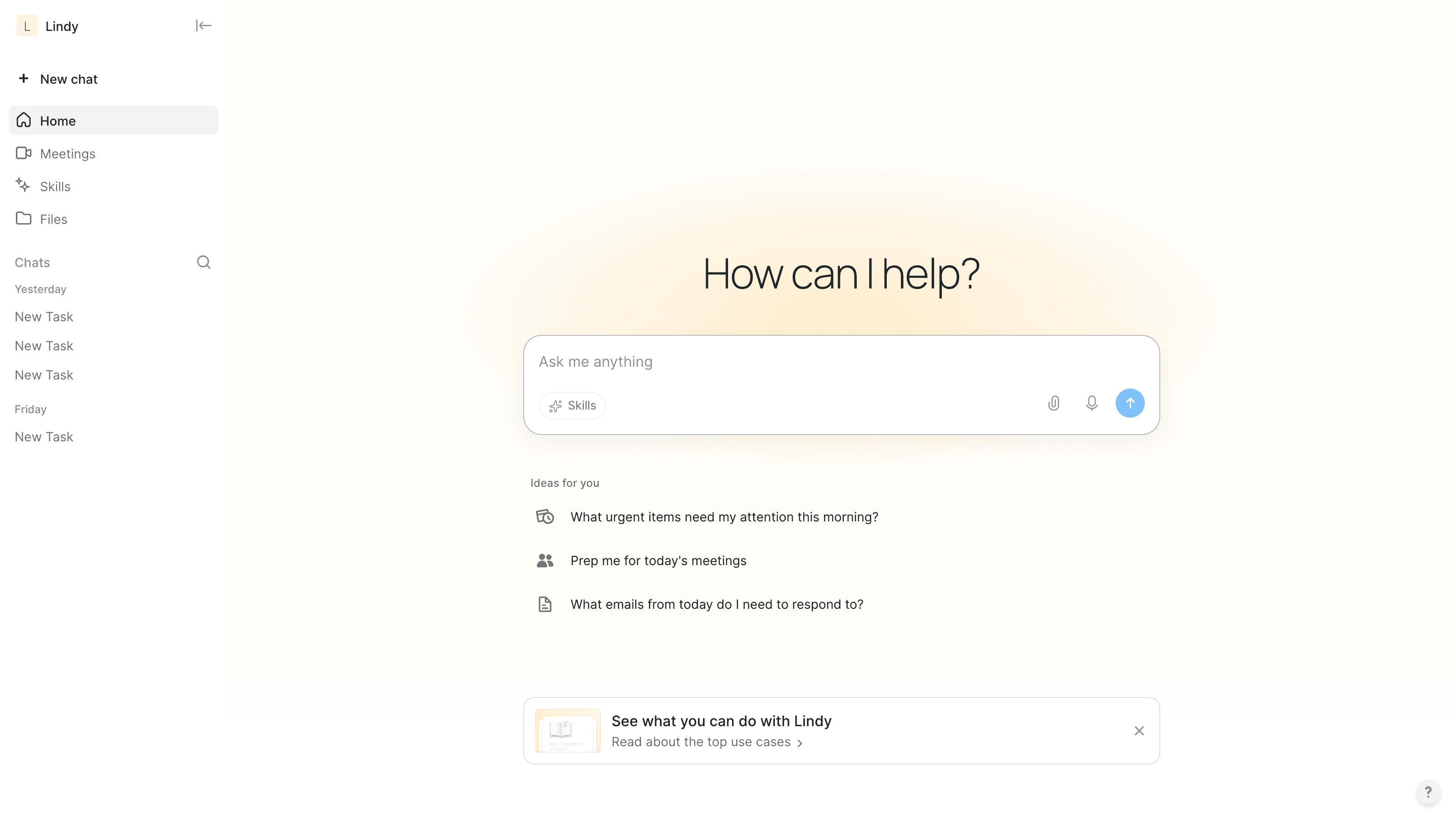
Skills library
Designing a skills library where finding a skill and running it are one continuous move
Overview
Lindy is an AI assistant platform. Skills are what the assistant can do on your behalf: check calendars, triage an inbox, chase an invoice. The Skills library is where people find them, understand them, and decide to use them.
I designed and built that library, and the surface it hands off to. The case study below walks the flow end to end: browse the library, open the palette from the composer, read what the skill will do, run it, answer the one question it needs you for, and land on a booked meeting.
I worked as a design engineer inside Lindy's production monorepo, so the screens here are the running app rather than a mockup of it.
System overview
The core problem was not listing skills. It was that finding a skill and using a skill were two disconnected places.
A user browses a catalogue on one page, installs something, then goes to chat and has to remember what they installed and how to invoke it. Every seam in that path is a place to drop out. So the library had to work in two configurations of one component: a full page for browsing, and a palette inside the composer for the moment you actually need it. And the skill had to arrive in chat as something you can see running.
Problem space
The starting point measured badly. Every number below was read off the running DOM rather than from source.
• 24 identically weighted cards, with nothing separating an installed skill from an available one, a built-in from a marketplace item, or a suggestion from the full catalogue
• Install, the action a user came to perform and the one repeated twenty times, was grey and 12px; Create skill was the only blue object on the page and the largest button on it
• 844px from a skill's name to its Install button, so the eye had to cross the whole card to act
• Weight 500 was used 81 times against regular's 56, so nothing on the page read as emphasis
• Six icon stroke treatments on one page; at one ratio the icon was 0.86× the text beside it, functioning as punctuation rather than as an object
• Opening the library from the chat nav produced a menu inside a menu, and one skill rendered its author three times
The library as rows
Cards promise a container and then leave it empty. Rows do not promise anything, so nothing is missing, and they buy presence from space and icon size instead of from borders and fills.
Rebuilt as rows, the row itself becomes the action. Install is revealed on hover, where the cursor already is, which closes the 844px journey to the button. Starring moves to the right and sorts starred skills to the top, so the skills you actually use rise out of a catalogue of twenty. Built-ins stop being cards at all, because they are not choices: they are always on, and they say so.
The section labels dropped to sentence case to match the home screen next door, which had been using a quiet group label for the same job while this page shouted it in uppercase.
The same library, inside chat
The palette is the same component in a second configuration, not a second component. That is what killed the menu-inside-a-menu: one list, rendered in chat mode or library mode, rather than two implementations drifting apart.
It opens from the composer, so you never leave the conversation you are already in. Skills sit on the left with their state visible, and the right pane answers the question a user actually has before handing over a task: what will this do. Three numbered steps, and a sample phrase to say.
A skill is a document, so the document is readable. The instructions file sits behind a tab rather than being hidden as implementation detail, which is how Anthropic presents skills too. If the assistant is about to act for you, you should be able to read the brief it is working from.
From a skill to a command
Choosing a skill inserts it into the composer as a slash command and leaves the caret after it, so you finish the sentence in your own words rather than filling in a form. Typing the command directly does the same thing, which means the palette teaches the shortcut instead of competing with it.
The command paints blue inside the input. That required a mirrored highlight layer behind the text, because a plain textarea cannot color a substring, and the alternative was to swap in a rich text editor and inherit every paste, caret, and IME bug that comes with one.
Watching it run
Restyling a catalogue does not answer the question the product had not answered: what does a skill look like while it is working. Two directions put the run in a container beside the thread, as a live card and as a docked panel. Both were rejected for the same reason: they draw a second place for the assistant to be, and the seam between chat and not-chat is exactly what this project existed to remove.
The shipped answer reads the run as messages in the thread. The work narrates itself in specifics rather than a spinner, naming which calendars were checked and over what window, and the working indicator hands off to whichever line is newest so your eye follows the work down the page.
The composer used to drift 347px during a run as content pushed it around. It now moves 0px, so the one thing you might want to interrupt with stays exactly where you left it.
The moment it needs you
The run reaches a decision the assistant should not make alone, and stops. This is the part of an agentic flow that most interfaces get wrong: they either decide silently and surprise you, or they dump a wall of options and make you do the work again.
The question arrives as prose, and the answers are three identical containers. Identical is the design decision. Any visual difference between the options, a filled button on one, a lighter treatment on another, is the interface arguing for an answer it has no standing to argue for. The third option is an exit, not a failure state: neither of these, keep looking.
The composer stays live throughout, so the choice never becomes a modal you have to satisfy before you can say anything else.
Solved
Picking a time collapses the stack to a single ticked line, so the thread reads as a record of what happened rather than a form still waiting to be filled. The outcome sentence names the time you chose, which is the cheapest possible confirmation that the system heard you correctly. The calendar card follows a beat later.
From opening the palette to a booked meeting, the user typed one sentence and made one choice, and never left the conversation.
The layer underneath
None of the above was reachable as a styling pass. The brief that started this work was that a background gradient looked dated. The audit found the gradient was a 1.98 MB raster, one of roughly 4.2 MB of decorative image, and that the product carried 10 semantic CSS custom properties against 748 on the reference surface I measured for comparison. There was no token layer to restyle.
So the first slice was the layer itself: around 30 named values with light and dark variants, plus a build check that fails on raw hex, raw rgb(), hard-coded font families, literal shadows, and raw px font sizes in these paths. It found 9 raw values on its first run, and later caught a raw 13px font size that I had written myself on the composer's Skills button. That is the argument for a guard over a written convention: a document describing the rule would not have caught me breaking it right after writing it.
The work also produced an exploration set of 54 prototypes, each answering one question and each carrying its status on the card. Rejected directions are recorded at the moment of rejection with what they gave, what they cost, and why they lost, so the reasoning survives instead of being reconstructed later.
Scope of role
I worked as a design engineer across the whole arc: the audit, the prototype set, and the implementation, all inside Lindy's production monorepo rather than in a separate design file.
That included the extraction tooling used to measure the existing product and its reference points, the token layer and the build guard that enforces it, the prototype generator behind the exploration index, and the shipped frontend for the library, the palette, slash-command insertion, and the run.