Litebub
Quick Shareable Chat Links
How can we continue the conversation without having to be logged into the same platform?
Responsibilities
UX Design
UI Design UX Research
Prototyping
Product Management
Team
Leslie Liu
Afsheen Amirulia
Abrar F
Date
2021
Quick Summary
We were in a hackathon and thinking about common problems with communications in the pandemic. One of the key things that kept coming up was the concept of having a large zoom room that you're in, and needing to break off into a smaller one without losing the connection. People would tend to chat and share links within the chat section of the app that would vanish when you'd close the window. *yellow highlight is to aid in speedy scan-ability
Problem
Users want to branch out from a current call (zoom) without logging into a new platform.
Understanding the Problem
People like to communicate, but a lot of times there are borders that must be crossed in order to initiate or continue a conversation. Even in an in-person experience, there is an exchange of numbers / links, contacts, anything to keep the conversation going but there are always levels of friction in sharing those between users. The specific problem we're solving for this particular problem there is 1 existent link already (ability to share a link with users).
Context: most social networks require a login and if there are random friends / coworkers you just met, you won't know the common social networks to potentially join to continue a group chat, voice chat, etc.
Goal: Make continuing the conversation easy for users (no login)
Litebub - Quick Shareable Chat Links
Research
Market Research
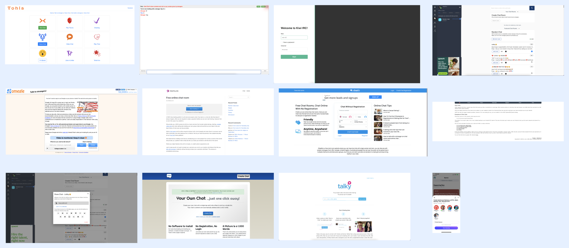
There a lot of sites that do a lot in private messaging or sharing chat links, but they all look pretty outdated, it's straight forward chat. I know there are audio chat platforms and other more up to date ones, but struggling to find them. App versions don't make sense as most users on zoom are going to be on their computer.
- The link sharing experience doesn't instill confidence (no toasts or showing of copied link)
- The messaging experience is generic (traditional messaging)
- Voice chat isn't wanted or easy for everyone, plus requires microphone access
User Research
User Interviews In chatting with potential users of litebub, we found a few things in common.
- When doing zoom call, users also want to be able to copy the notes in the chat (clipboard or to a pdf)
- Copying a link as a just a URL (no rich media) comes off as scary to users sometimes. (non friends clicking)
- People like entertainment in chat, the solution of just creating a chat room though wasn't enough of a pain point. Needs to be some additional element.
- People lack context of chat when there is just a link- What is the chat about?
- Sharing a password to a link vs a link was attractive to one user.
Mapping
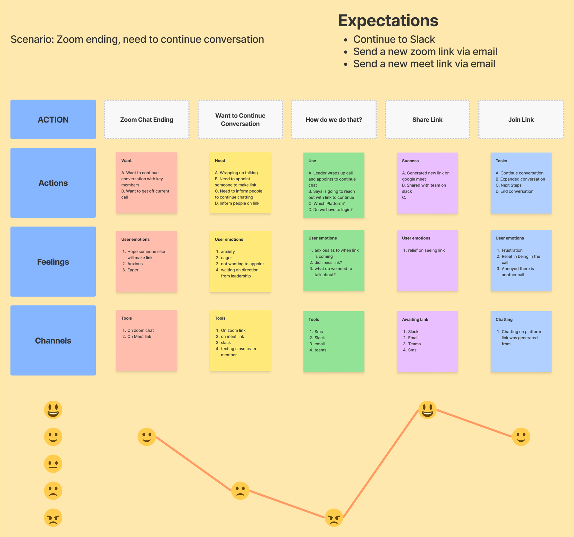
Mapping the thought process and emotions in generating a link while an existing zoom chat is going. Action: Users want to break off into a smaller group for continued chat.
- People don't want to generate the link (if given leader isn't present)
- Thought process on how the link is generated and sent out
- Eagerness to receive link before logging off of Zoom (in chat)
- Do I have to log back in?
- Did the link come? Did I miss the link?
- Did everyone get it?
Insights
Users want a link quickly prior to signing off call
Friction point: having to log in
Friction point: not knowing when the link is arriving
Friction point: not knowing topic of discussion
Friction point: creating a new group chat in slack is unfavorable
Friction point: how is link coming? email, sms, slack etc.
Who are we designing for?
We created 2 personas that apply to the pain / friction points as well as user needs
1. Business Chat Smooth Sailor
- Attributes
- Time is valuable
- Values constant movement
- Likes to make progress as a team
- Goals
- Get things done efficiently
- Don't lose people due to timegaps
- Respect peoples time
2. Internet Super Networker
- Attributes
- Super networker on social media
- Optimizing for learning from other people without friction
- Wants to meet high value people without restrictions
- Wants to expand high conflict conversations
- Goals
- Keeping the conversations active
- Keeping people informed on what they're joining.
- Keeping things fun
- Have a low friction conversations that build networks or intelligence
What Do Users Need?
Users need a bridge to the next conversation without friction
- Something easy to execute
- Quick to execute
- Shareable
- No Login (lowest friction)
- Set expectations for chat
- Something approachable and safe feeling to join
Constraints:
- Think of ways to monetize
- Reasons a user would continue to come back outside of generating a chat link
Potential Solutions:
- A chrome chat plugin that autogenerates links
- A website that creates chat links quickly
- A mac store download for chats
- An iOS or Play store app that generates chat links
The goal was to create something super simple, and low friction. A website is by far the lowest friction environment that anyone would have access to without technical constraints.
SOLUTION 💡
A website that creates links quickly, no login, and something fun or approachable for users to use. This can be optimized for mobile and web, and has the least friction for users logging in.
Sketching and Ideation
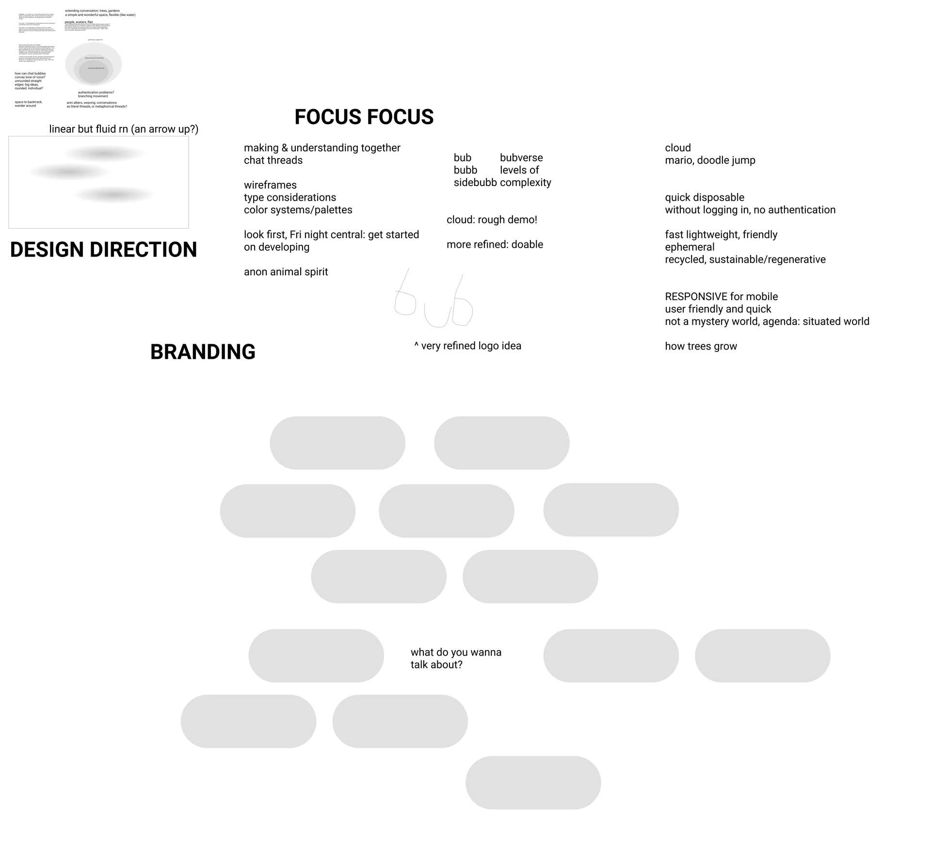
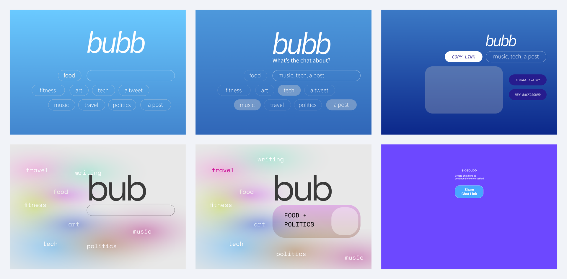
For this particular project we jumped pretty quickly into figma for ideation as we were all in different cities and it was nice to do a collaborative session. Some very loose drawings which haven't been included. One company that was of huge influence was WeTransfer in their ability to make it super simple to send a file, but have a unique environment for the user with full screen backgrounds.
Key pain points to solve for:
- Quick to make links
- Lightweight
- No Login
- Disposable
Sketches User Feedback
Positive 👍
- People like getting link right away
- Like no login
Negative 👎
- Confusing having to choose a topic on front page, is it a chatroom, or a new room?
- I don't like the topics, do I have to choose one?
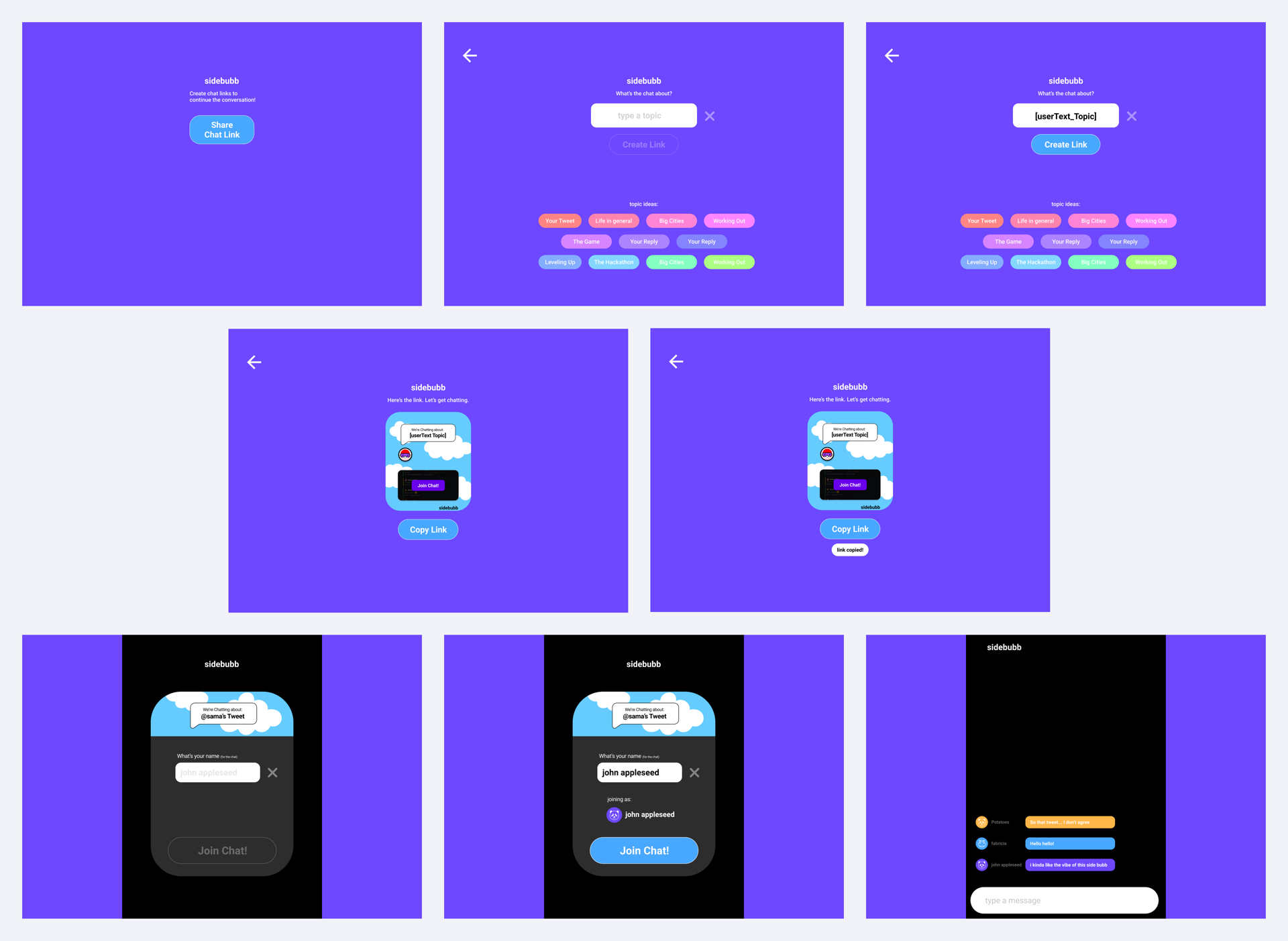
Given the feedback, we went with the most simplified approach in showing a button to get a link on index, but still allowing the concept of an optional topic.
Iteration 2 - Link quickly, topics secondary
This tested much more positively with the internal team and presenting to users.
Topics played a secondary role to typing at least 1 letter to create a link.
Add Fun - Create avatars
- My teammate created some funny avatars to bring joy when you join the chat.
- It created a unique scenario to change to a unique character (12 avatars, 12 colors) every time you login. Also much more unique than the traditional animals you might find on google docs etc.
- It also helped build our color scheme for the app.
[INSERT] A LOT OF ITERATIONS on UX in BETWEEN...
We did a lot It, and it was about working as a team efficiently, testing out product and see what was making sense and iterating from there.
Litebub - Quick Shareable Chat Links
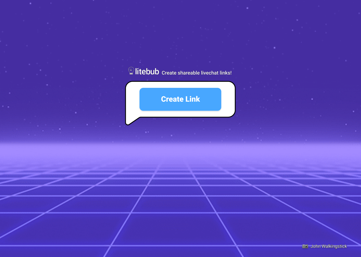
Super simple front page. Goal: Get user to create a link without friction!
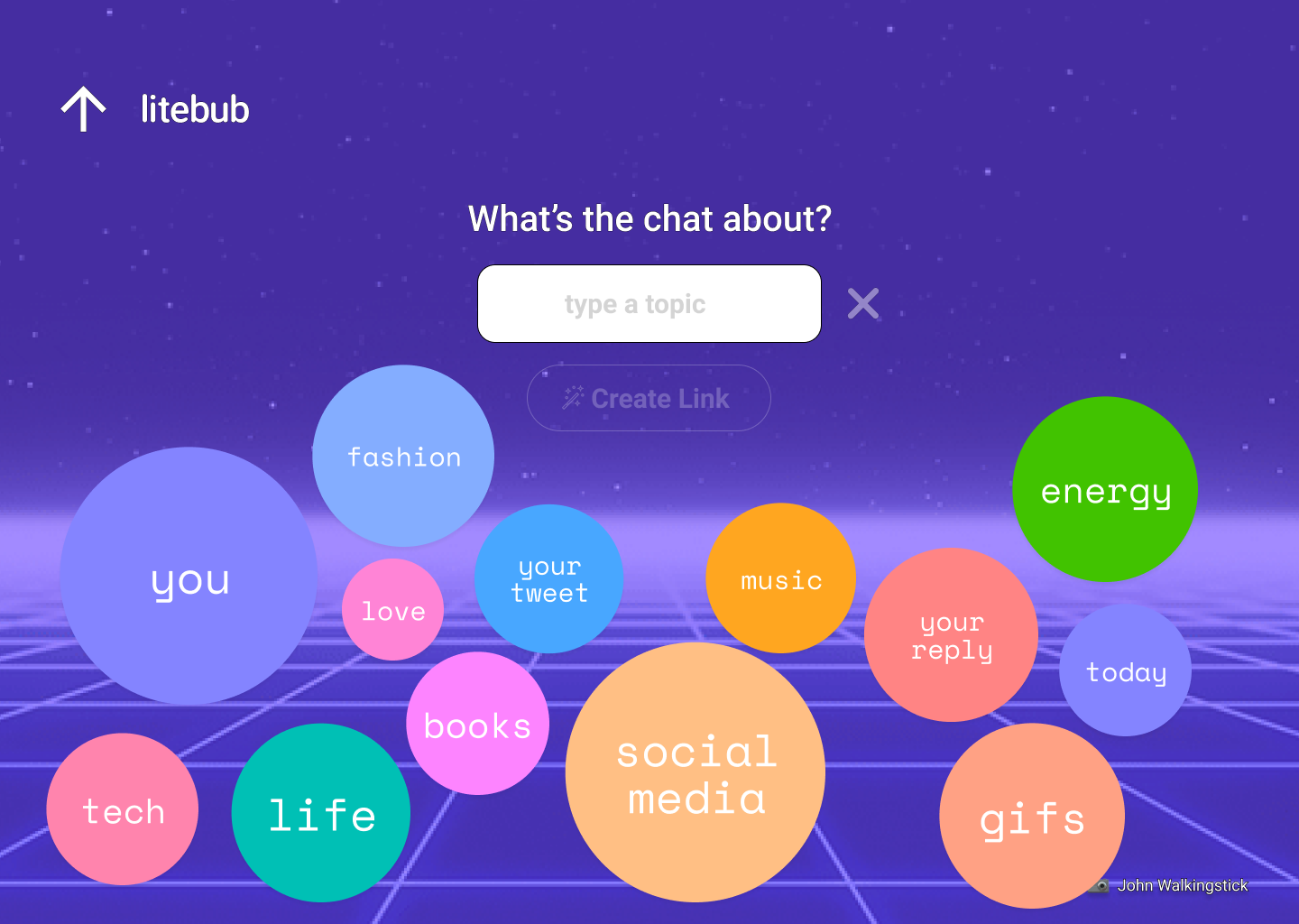
Topics are key to set the context of the conversation. We set out to making choosing a topic easy by clicking some bubbles, otherwise the user could type anything they wanted.
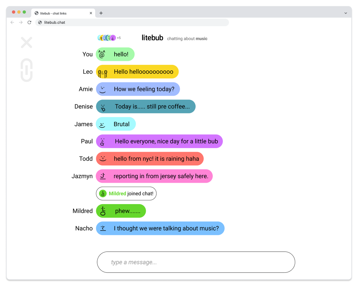
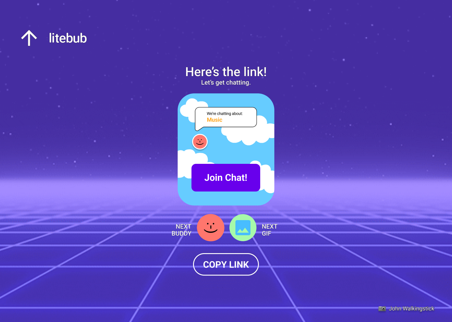
We wanted to make links cool! something fun and interesting to click in vs a URL. We came up with the concept of having a gif you could swap out, as well as your "buddy" avatar.
We spent some time considering what chat would be like. Leslie came up some really interesting concepts in showing the "typing" action with having the bubbles race across the screen similar to a horse race.
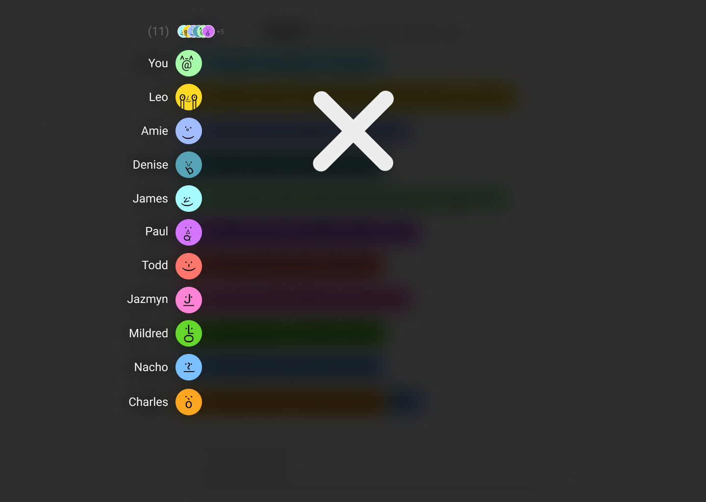
The contact list was a challenge, we wanted to create something that was easy to develop and ideally something without scrolling. This one tap view into contacts (tap top buddy avatars next to LiteBub) was super fun and pretty easy to build.
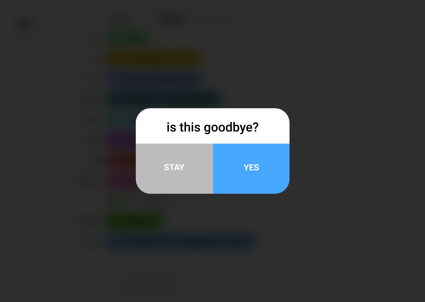
One extra piece of goodness Leslie came up with was random exit prompts for leaving chat. Other examples such as "Run away?" "Exit Noisily", "Get me out of here" were some others we included.
Wrapping It Up 🎁
How did users respond?
Prototype testers responded well for this one, they were most excited about the movement of the bubbles like a horse race(some twitter users). The shareable link was of great value for people especially in social media setting, people were eager to use it as it launched. One other startup even asked if they could use it for their core product.
What's Next?
We've iterated a lot on chat but there's been a lot of interest in the changing of backgrounds (NFTs) and this could be a place where we expand.
Challenges and Learnings
I learned it's much better to keep hitting small milestones, than try and extend into a more finessed product. Much better to launch lean version of product (mvp) vs trying to hit all bells and whistles in 1st launch.
What Would You Change?
I think it would've been better to design the product a little bit simpler in the beginning regarding avatars and gifs for link, we could've shipped things earlier and iterated if we didn't have as much in the pipeline. Another thing was the Thwack functionality was a challenge in booting users, cool feature though.
Check Out the Website! (under construction)
